
Outcomes
Outline of four assumptions that were tested during Trial 1 and their corresponding results.
1. Login and Registration
Assumption: Users will be able to login and register their organisation on Accreditron.
We implemented a passwordless login process to improve security and prevent that pesky problem of forgetting your password. We know from experience that some of our users are likely to use the same password across multiple devices which is a security risk to Accreditron. We designed around that: when you sign into Accreditron you enter your email then check your email for a link that directs you into Accreditron as an authorised user. Even though passwordless login systems are commonly being implemented across the web, we still wanted to check that social service providers intuitively understood the process.
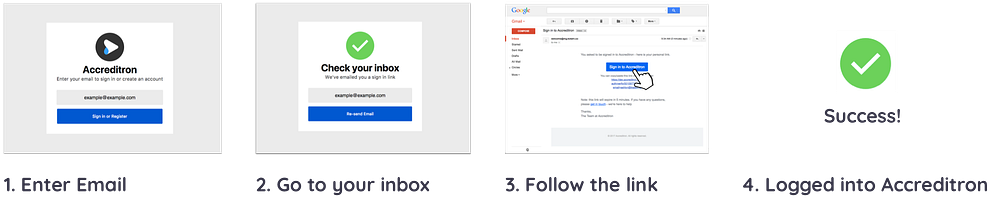
Finding: None of our users got stuck and they found the process easy to understand! While the passwordless login was a new experience for a number of the trial providers, the interface and simple directions on the initial screen for Accreditron was easy for them to follow.
Result: This is a real win for Accreditron; it lets us know that users’ first interaction with the platform is not only intuitive but also that it is approachable enough for users to be guided through new processes without unnecessary frustration.
2. Setting Expectations
Assumption: Social Service Providers will use Accreditron to submit the Accreditation Pre-Assessment for review to an MSD Assessor. At the beginning of the process, we want them to have their expectations set so they have no surprises.
Before providers begin their pre-assessment there are a few things we want to convey: their pre-assessment auto-saves, they can fill it out in any order, and they should reach out to their assessor if they need help. Because information will auto-populate into form fields on Accreditron they will still need to verify and check that all information they are submitting has been reviewed.
We assumed that a provider would tick to verify their information as they finish each section of the process.
Findings: For the majority of users, the way expectations were set at the start was effective with a number of people even getting pretty excited about our auto-saving feature. However, we found that a quarter of users either didn’t make use of the verification system or only did so sporadically. One of the providers who consistently verified offered some insight: she suggested that the box that you click on to verify might need to be more obvious and that might improve her experience.
Result: Our approach to the potential issue that verification presents has been two-fold: we’ve re-designed our on-boarding page to make it more engaging so that expectations are even clearer at the beginning of the pre-assessment. We’re also redesigning the verification box so that it’s more obvious to users and encourages them to interact with it.
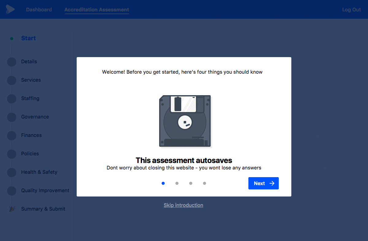
Updated Accreditron user flow for setting expectations
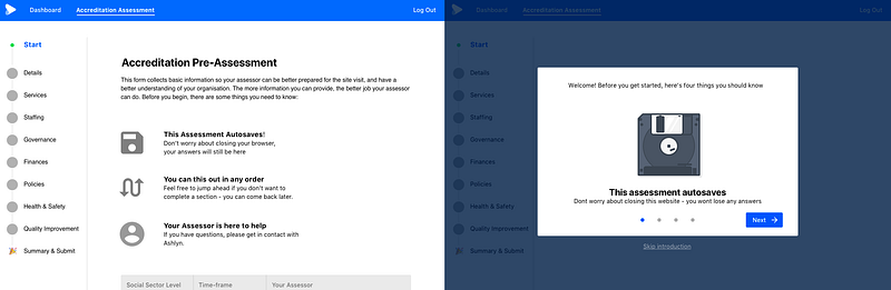
Comparison of before versus after usability research
3. Question and Content Comprehension
Assumption: Users will find the process and content such as questions and functionality engaging and easy to understand.
Accreditron is made up of questions. By using simple, easy to understand language we can help to make sure things go smoothly for everyone involved. The same goes for functionality, things like which buttons to click and how they work. We wanted to know what made sense to users and what could be clearer so that we could figure out how to offer the best possible experience.
Finding: With so many different providers from a range of different backgrounds making use of Accreditron we’re highly aware of the need for it to be as accessible as possible. While most of our questions and functionality made sense to users the use of specialised terminology was highlighted as a potential pain point by a number of users. For example on a question referring to provider operated programmes as services one provider noted that it was possible: “they wouldn’t think of their programmes as services.”
Result: What this shows is the importance of having questions that are as straightforward as possible. While the overall response to our questions was positive we want to perfect the experience and make it as accessible as possible. To address this we have taken onboard provider feedback and have been working with Ministry of Social Development and Statistics New Zealand to make sure our question set is as practical and easy to understand as possible. When we’ve finished this process we’ll also be going over our questions again making sure they’re all in plain English.
4. Navigation
Assumption: Users will be able to navigate their way through Accreditron and will find the process intuitive both conceptually and practically.
Computers are becoming more and more commonplace in our daily lives, the thing is, not everyone uses them in the same way. Understandably navigating through Accreditron is crucial to its use, however, making sure that it is easy to do so can be difficult; what makes sense to one person might not make sense to someone else. Finding out how people interact with our current navigation system lets us know if it’s intuitive but also if it’s possible to optimise it for use by as many people as possible.
Finding: Overall, navigation proved to be a pain-free experience for most users. There was one finding in this area however that proved to be of particular interest to the team here at Accreditron. Because Accreditron collects a lot of information, we sometimes hide forms within larger forms that only display when you click the card to expand it. When one of our trial participants was filling out fields within a card, they would use the scroll-bar on the side of the screen to move down the page. Because this involved clicking outside of the form card, the card would then minimise thinking the user was intentionally closing it, making it feel difficult to continue with the task.
Result: For us, this was a perfect example of why usability testing is so valuable to the design process. We hadn’t encountered this issue before as we all used our mouse scroll wheels or two fingers on our trackpad to move down the page. Thanks to usability testing and the generosity of providers in giving us their time we were able to pick up on this potential issue and make sure it wouldn’t happen again.
Overview
The response to Accreditron was overwhelmingly positive, to put this in perspective one of the questions in the final questionnaire asked participants to respond to the prompt: “I would opt to use Accreditron rather than the current process.” 100% of participants agreed with this statement with eight indicating that they “Extremely Agreed” the highest possible option. Beyond this we also received valuable feedback on how we could improve our platform in various ways, through function, language, and design.
Last updated